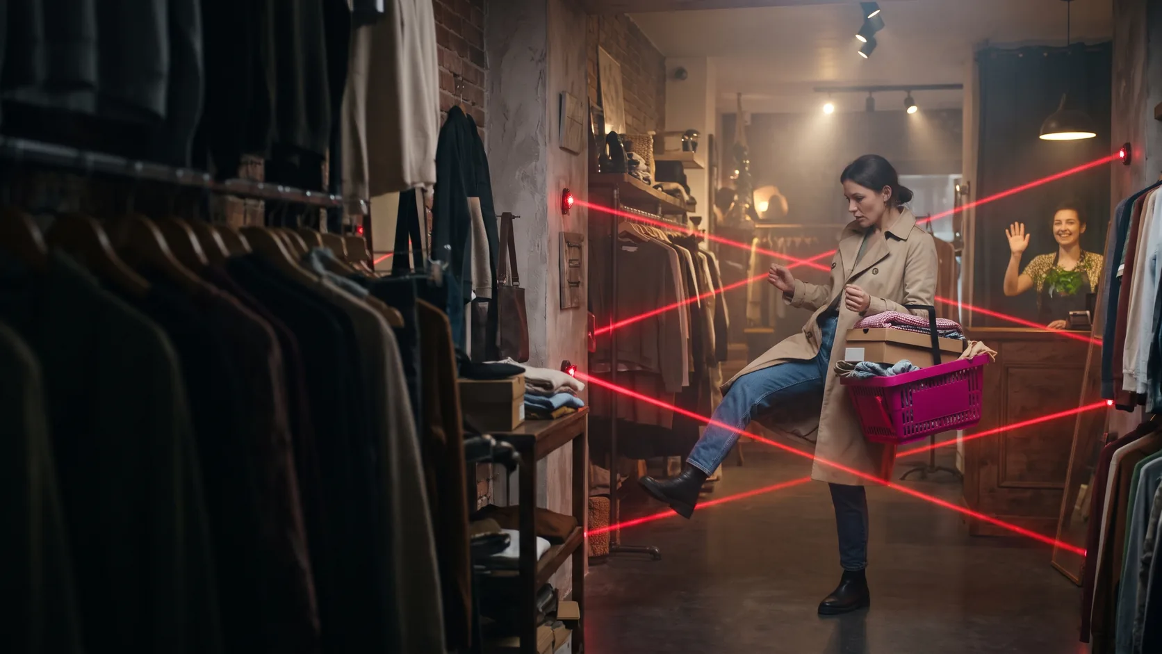

You open the weekly report and see two numbers that refuse to get along: fifteen hundred visitors and three orders. The ads are running, the shop gets some search traffic too, people are definitely coming in. And the till is silent. The first urge is “let’s run a discount”, the second is “let’s rebuild the site”. Both are expensive, and both can miss the actual cause.
A shop loses a buyer at a specific step: they couldn’t find the product, couldn’t figure out the size, saw the shipping cost, got scared off by registration, didn’t trust the shop. Each of these steps shows up in analytics and can be fixed on its own. This article is about the website: what in it stops a person from reaching the payment step. If your sales go through a sales manager and clients say no during a call or in a chat, that’s a different problem, and there is a separate article on it: how to record the reasons people say no and stop guessing.
One hypothetical example runs through the whole article: an online store for outdoor gear. Tents, backpacks, sleeping bags, thermal underwear: products with sizes, weights and a pile of questions before anyone buys.
1. First figure out: no traffic, or traffic but no purchases
These are two different illnesses, and they need different medicine. If forty people visit the site a week, the problem is acquisition: search, ads, social media. Then you need a technical SEO audit and work on your channels, not a rebuild of the cart. But if you have hundreds or thousands of people and a handful of orders, the problem is inside the shop. That’s what the rest of this article is about.
Conversion rate is simple to calculate: the number of purchases divided by the number of visits (sessions) over the same period. But a single number tells you nothing about where the drop happens. You need a funnel, the sequence of steps from viewing a product to paying.
Google Analytics 4 has recommended ecommerce events for online stores. These are the ones that make up the core funnel:
| GA4 event | What it means | If there’s a big drop here, look at |
|---|---|---|
view_item_list |
the person saw a list of products (catalog, search results) | search, filters, categories |
view_item |
opened a product page | catalog and navigation, if few product pages get opened |
add_to_cart |
added a product to the cart | the product page: photos, description, price, availability, sizes |
begin_checkout |
started checkout | the cart: shipping cost, order total, mandatory registration |
add_shipping_info |
entered shipping details | shipping options and costs, delivery times |
add_payment_info |
entered payment details | payment methods, trust in the site |
purchase |
the order is placed | errors on the last step, payment page failures |
To see how many people get from one step to the next, open the “Explore” section in GA4 and choose the “Funnel exploration” template. Add the steps using the events from the table. Google’s help page explains how to switch between an open and a closed funnel: in a closed funnel a person is counted only if they entered at the first step, in an open one they can join at any step. For a shop it’s handy to start with an open funnel and break the report down by device category: phone and desktop often show two completely different pictures.
Before drawing conclusions, check that the events are actually being sent. A typical situation: purchase doesn’t fire on card payments because the person returns from the payment page to a different URL, or it fires twice after the thank you page is reloaded. Place a test order with every payment method and check that it shows up in the “Realtime” report.
In our outdoor store the picture might look like this (hypothetically): people open product pages willingly, noticeably fewer add to cart, and even fewer get to checkout. So the product page and the cart are what need checking, and the menu can wait. The sections below follow the buyer’s path in order.
2. Products are hard to find
A buyer who came for “a light tent for two” shouldn’t have to guess where it is. If the categories are hidden under a “Catalog” button in the corner and the homepage shows four promo banners, some people simply won’t find the way into the range.
What to check:
- Categories are visible right away. The main product groups are reachable from the main menu or the first screen: “Tents”, “Backpacks”, “Sleeping bags”, “Clothing”, “Camp kitchen”.
- Grouping follows the buyer’s logic. People search for “tent for two for the mountains”, not “item code series X”. Subcategories can go by purpose (camping, trekking, winter hiking) and by type.
- Search understands people. Type ten typical queries into the search yourself: with a typo (“sleeping bga”), in another spelling (“ultralite”), with a synonym (“karrimat” and “sleeping mat”), with a brand name. If half of them return “nothing found”, you’ve just seen where part of your visitors disappear.
- Filters answer real questions. For a tent that’s capacity, weight, season, price, availability. A “Color” filter matters less for tents than “Weight under 2 kg”. Check that filters can be combined, that the number of results is visible after selecting, and that on a phone filters open and close without a fight.
If GA4 shows plenty of view_item_list events but few view_item, people see the list but find nothing in it worth opening. The cause is often the thumbnails: no price, no key spec, identical photos on white.
3. Navigation speaks warehouse, not buyer
A separate problem with menus: names that only make sense inside the company. “Pro line”, “Collection 24”, “Accessories 2”, supplier abbreviations, internal series names. To whoever built the catalog it’s all logical. To someone on the site for the first time it’s code.
A simple test: show the menu to a friend who knows nothing about your range and ask them to find a gas stove. If they hesitate between three items, the names aren’t working. The rule for menu item names: the word a buyer would type into search themselves. A series or brand name belongs in the menu only if people search for exactly that.
Two more things worth checking:
- Breadcrumbs on product and category pages. A line like “Home / Tents / For two” lets people go up a level with one tap, without another trip through the menu.
- The menu on a phone. It usually hides behind a hamburger button (same on our site). Check that it has the same categories as on desktop and that nested levels expand instead of leading to empty pages.
How to build a structure of sections and menus so people don’t get lost is covered in detail in a separate article on website navigation and structure.
4. Mandatory registration and a long checkout
The person has already decided to buy a sleeping bag, clicks “Checkout”, and the site replies: “Create an account”. A password with requirements, email confirmation, a message that lands in the “Promotions” tab. Some people close the tab at this step and go where they can just enter a name, phone number and address.
In Baymard Institute’s open research (the list of reasons for cart abandonment, updated September 2025), among US shoppers who abandoned checkout (those who were “just browsing” are counted separately), having to create an account scored 18%, and a checkout that was too long or complicated 17%. The figures come from the US, not your market, but they show the main point: mandatory registration cuts off some of the people who had almost bought.
What to do:
- Offer guest checkout. You can suggest an account after the purchase: “Save your details to check out faster next time and track your order”. After paying, the person trusts you more.
- Remove unnecessary fields. According to the same Baymard data, the average checkout on US sites shows 23.48 form elements, while 12-14 is enough. Look at your form through the buyer’s eyes: date of birth, “how did you hear about us”, a separate middle name field, a duplicated address, a mandatory email for parcel shop delivery. Every field should be needed to fulfil the order; make the rest optional or remove them.
- Don’t wipe the form on an error. If someone entered their phone number wrong, they should see what exactly is wrong right next to the field, and not have to fill everything in again.
- Show how many steps there are. One page, or 2-3 steps with visible progress. Not knowing “what’s next” stops people too.
5. The product page doesn't answer the buyer's questions
Once someone opens a product page, they have specific questions. Will the tent fit in my backpack, how much does it weigh, will it stand up to wind, is my size available, when will it arrive. A product page that doesn’t answer them sends the person off to look for answers in another shop. And that’s most likely where they’ll buy.
| Product page element | Bad | Good |
|---|---|---|
| Photos | one supplier photo on a white background | several photos from different sides, pitched and packed, details, scale next to a person |
| Description | the manufacturer’s copied text or “A great tent for your holidays” | key specs as a list: capacity, weight, packed size, waterproofing, season; then, in plain language, who it’s for |
| Price | “Ask for price” or a price with no currency | price visible right away, discount clear, no surprises in the cart |
| Availability | the product is in the catalog, but at checkout it turns out it’s not in stock | clear: “in stock”, “made to order, ships in N days”, “out of stock, notify me when available” |
| Sizes and variants | a dropdown with “Option 1, Option 2” | color and size chosen with buttons, size chart right there, unavailable variants marked |
| Buy button | small, grey, lost among icons | prominent, within thumb reach on a phone; after tapping it’s clear the product is in the cart, with a way to go to checkout |
A few more small things that cost sales:
- Quantity field. If someone wants three gas canisters, they should be able to pick “3” on the product page or in the cart, not add the product three times.
- Size chart with measurements. For thermal underwear or boots, “M” isn’t enough. Give chest size, height, insole length in centimeters, and advice on what to do if someone is between sizes.
- Reviews and questions. Real, dated reviews, including the imperfect ones. A shop where every review is five stars and written in the same style raises more suspicion than one with a few honest “could be lighter” comments.
- A “shipping and returns” block right on the product page. Briefly: dispatch time, shipping cost or the free shipping threshold, return conditions with a link to the detailed page.
If GA4 shows product pages being opened but few add_to_cart events, start here. Open your five most popular product pages on a phone and try to answer the buyer’s questions using only what you see on the screen.
6. Popups that get in the way of buying
A “Subscribe and get a discount” window covering half the screen two seconds after arrival, then a chatbot, then a cookie banner, then a notification request. On a phone, the person no longer sees the product, only four little crosses, one of which is hidden.
In its documentation for site owners, Google explicitly advises avoiding intrusive interstitials and dialogs: they make it harder for both people and search engines to understand the page content. The alternative suggested on the same page is small banners that take up only part of the screen.
How to do it sensibly:
- one window per visit, not a cascade;
- not in the first second, and not on a product page while the person is looking at photos;
- a visible close button, and closing by tapping outside the window;
- a closed window doesn’t come back on every next page;
- on a phone, a small strip at the bottom or top instead of a window covering the whole screen.
7. Shipping is expensive, or its cost only shows up at the end
The person picked a backpack, went to checkout, and only on the last step found out what shipping costs. Or worse: shipping is “at carrier rates” and they’ll only see the exact amount at the pickup point. For many people, that’s the moment the purchase stops.
In the same Baymard research, the most common reason for abandoning checkout is extra costs that are too high (shipping, taxes, fees), named by 40% of respondents. Separately, 12% said they couldn’t see or calculate the total order cost up front. There’s a legal side as well. In the EU, the Consumer Rights Directive 2011/83/EU requires the seller to tell the buyer, before a distance contract is concluded, the total price including delivery charges, along with the seller’s contact details. Ukraine has similar rules (Article 13 of the current Consumer Protection Law).
What to check and do:
- Shipping cost is visible before the cart. On the product page or in the cart: “Delivery to a parcel shop from N, free over X”. If the cost depends on weight, give a guide figure or a calculator by city.
- The free shipping threshold next to the cart. “Add N more and shipping is free”. Base the threshold on your own average order value and margin, don’t copy a competitor’s.
- Several delivery options. Parcel shop, parcel locker, courier, click and collect if you have a warehouse or store. For bulky items like a tent or a camping table, people want to know whether the parcel will fit in a locker.
- Payment methods your buyers are used to. Card payment on the site, Apple Pay and Google Pay, cash on delivery, and for pricier items, paying in instalments. According to Baymard, 9% complained about not enough payment methods and 10% about a declined card: if the card doesn’t go through, the person should immediately see a fallback option, not a blank page.
- No “surprises” on the last step. A cash on delivery fee, paid packaging, insurance. If you charge them, say so before the person has entered all their details.
8. Delivery takes too long, or the timing is unclear
At Baymard, “delivery was too slow” is the second most common reason for abandoning checkout, at 20%. But often the problem isn’t speed itself, it’s uncertainty. “Delivery 1-14 days” sounds like “someday”. For someone heading off on a hike on Friday, that’s a dealbreaker.
The buyer needs two numbers, not one: when you’ll ship, and how long the carrier takes. “Ships the same day if ordered before 3 pm, the next day after that” plus “delivery usually takes 1-2 days” gives the person a clear date. If a product is ordered in from a supplier, say so on the product page, not in an email after payment.
Even without changing your logistics, you can show an estimated delivery date on the product page and in the cart, mark products that ship from the supplier’s warehouse, and send the tracking number as soon as the parcel is handed over.
The EU directive sets a limit: unless agreed otherwise, the seller must deliver the goods without undue delay and no later than 30 days after the contract is concluded. Ukrainian law sets a similar limit of 30 days. In practice, the customer will leave much sooner.
9. People don't trust the shop
The last obstacle before payment: the person isn’t sure it’s safe to give you their money. According to Baymard, 19% abandoned checkout because they didn’t trust the site with their card details, and 13% weren’t happy with the returns policy.
Let’s start with the basics. The site should run over HTTPS on every page, with no mixed content. Since 2018, starting with version 68, Chrome has marked HTTP pages as “Not secure”. Today most platforms and hosts issue a certificate automatically, so a missing HTTPS is rarer than back when the first advice on online stores was written. But a certificate is only the minimum; it doesn’t make the shop trustworthy in the buyer’s eyes. Trust comes from other things:
- Contacts that actually reach someone. Phone, messenger, email, opening hours. The address of the warehouse or pickup point, if there is one.
- Seller details. The name of the sole trader or company, registration number, address. The EU directive already requires you to give the buyer the seller’s identity, address and contact details before the contract is concluded. Put them on the “Contact” or “About” page and in the site footer.
- Reviews from real buyers. On product pages, on a separate page, on external review platforms. A shop replying to negative reviews is more convincing than a shop with none.
- A clear returns policy. A separate page in plain language: how many days, in what condition, how to start a return, who pays for shipping, when the money comes back.
- Tidiness. Broken links, “under construction” pages, a sale that ended last summer, placeholder images. Each little thing is harmless on its own, but together they look like an abandoned shop.
Be honest about returns, because the law is involved here. In the EU, the Consumer Rights Directive gives the buyer the right to withdraw from a distance contract within 14 days without giving any reason; for goods, the period runs from the day they are received. There are exceptions, for example goods made to the buyer’s own specifications. Ukraine has similar rules (Article 13 of the current Consumer Protection Law). Have a lawyer in your country look over your returns page: a mistake there costs more than a consultation.
A buyer who sees “wrong size? Send it back within 14 days, here’s how” clicks “Buy” more calmly than one who sees “goods of proper quality cannot be returned”.
10. The site is slow and awkward on a phone
This point isn’t in the old online store checklists, but you can’t do without it today: in many niches, most buyers come from a phone. If the catalog takes several seconds to load, the filter responds with a lag, and the “Buy” button jumps because a banner finished loading above it, the person leaves before the product page even appears.
Google measures this with three Core Web Vitals: how fast the main content appears (LCP, good is up to 2.5 seconds), how fast the page responds to interactions (INP, good is up to 200 milliseconds), and layout stability (CLS, good is up to 0.1). They’re measured at the 75th percentile of real visits, separately for phones and desktops. INP matters especially for a shop: filters, size selection and the cart button should respond instantly.
What to check yourself:
- Go through the whole path on an ordinary phone over mobile data: homepage, catalog, filter, product page, cart, checkout up to the payment step.
- See whether anything covers the buy button: a chat, a cookie banner, a floating bar.
- Check that the phone number field opens the numeric keypad.
- Look at the GA4 funnel for mobile separately. If the drop there is much bigger than on desktop, the problem is almost certainly the mobile version.
Don’t forget technical failures: according to Baymard, 17% abandoned checkout because of errors or the site crashing. A payment page that throws an error once in twenty attempts looks like “people changed their minds” in the report. How to find out what exactly slows the site down is covered in the article on speeding up a WordPress site. The principles there work for other platforms too.
11. Where to start: a short checking order
- Set up or check the GA4 funnel. Events from
view_itemtopurchase, test orders with every payment method. - Find the biggest drop. Separately for phones and desktops.
- Check the matching section. Drop before the product page: search, filters, menu. Drop before the cart: the product page. Drop in the cart and checkout: shipping, registration, form, payment, trust.
- Walk the buyer’s path yourself on a phone, and ask an outsider to walk it while you watch in silence.
- Fix one thing at a time and look at the funnel a few weeks later, so you know what worked. If you change everything at once, you won’t find out what actually helped.
If you want a quick outside view, there’s a free website check: SEO, visibility in AI search and trust signals. When there are too many problems and patching them one by one costs more than rebuilding, it’s worth considering building the shop from scratch, with the funnel, shipping and mobile version built in from day one.
12. Conclusion
A shop rarely fails to sell because of one big reason. Usually it’s several small points of friction along the way: search doesn’t find “karrimat”, the product page has no weight, the shipping cost only appears at the end, registration is mandatory, on a phone the chat covers the button. Each of them cuts off some buyers, and together they produce the same picture: visitors, but no orders.
Don’t start with discounts, and don’t rebuild everything at once. Find the step in your analytics where you lose the most people, and fix exactly that. Then the next one. If you’d like someone who isn’t used to your shop the way you are to take a look at it, write to us at GrandMa, and we’ll work out together where to start.
13. FAQ
14. Sources
- Baymard Institute, Cart Abandonment Rate Statistics (reasons for cart abandonment, checkout form fields; updated 22.09.2025)
- Google Analytics, GA4 recommended ecommerce events
- Google Search Central, Avoid intrusive interstitials and dialogs
- Chromium Blog, A secure web is here to stay (Chrome 68, 2018)
- web.dev, Web Vitals, metric thresholds
- Law of Ukraine "On Consumer Protection" No. 1023-XII (Article 13)
- Google Analytics Help, Funnel exploration
- Directive 2011/83/EU on consumer rights